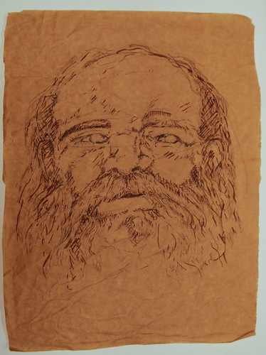
There are a lot of reasons why I don't draw much, and here is one of them!
Micron ink on brown paper. No reference used.
Showing posts with label ink. Show all posts
Showing posts with label ink. Show all posts
26 November 2011
Man


19 October 2011
H is for Hedgehog
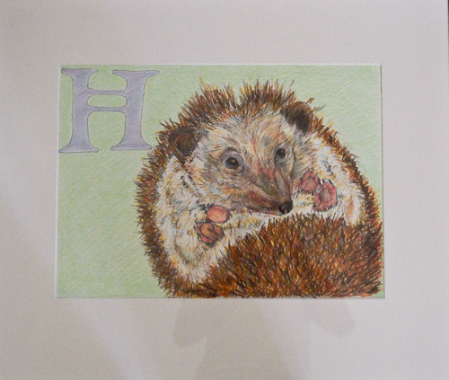
Like the booby before it, "H is for Hedgehog" is part of an illustration project I did for a design class: create thumbnails for a themed alphabet, and produce three full-size letters from that alphabet.
Prismacolor pencils and micron ink on illustration board.
Approx. 13"x18", not counting the borders. Framed and under glass.
17 September 2011
B is for Booby
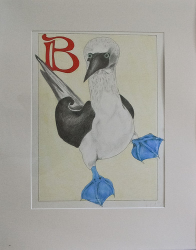
B is for Booby ("I'd rather dance with you,") is part of an illustration project I did for a design class: create thumbnails for a themed alphabet, and produce three full-size letters from that alphabet.
The booby is from the "unusual animal" alphabet series. I was totally going to do an "obscene/awkward animal" alphabet, but I chickened out / didn't want to draw the Cavendish Dik Dik, because goat-like things are hard to draw.
Prismacolor pencils and micron ink on illustration board.
Approx. 13"x18", not counting the borders. Framed and under glass.
08 September 2011
Blue-footed booby + announcement
ANNOUNCEMENT:
Hey, I take commissions! If there's something you'd like to see, please suggest it; if you'd like me to make something for you or for a special event, ask me!
Send requests to: m.katierose [at] gmail dot com, with a subject heading of "Ankle Cemetery"
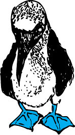
On to the illustration: those who know me know that I am particularly fond of the blue-footed booby. I drew this guy for my business card and letterhead when I was in college.
Pen and ink, scanned and colored in Adobe InDesign. No real reference used, but I have pages of doodles of this awkward little bird.
13 July 2011
Holy Ascension
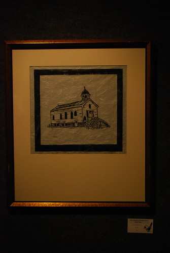
A woodcut print of the church I went to when I lived in Michigan. Now in a private collection.
First run (1/3), oil-based ink on rice paper, mounted over Canson Mi-Tientes.
11 July 2011
Blood Orange
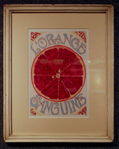
Postage stamp assignment for a Design 1 class in spring of 2008.
Drawn by hand with micron ink and colored pencil. Hand-lettered.
This piece is now in a private collection.
Juggling
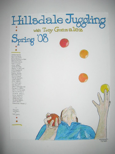
It's true, I took Juggling 101 as a physical education credit when I was in college. I did not actually manage to learn how to juggle, which was unfortunate, but Tony was kind enough to let me pass, once I made a poster in lieu of completing the performance part of the final.
Primacolor pencils and ink on illustration board. Typography done by hand.
31 August 2010
Storybook Art

This is an illustration for the Russian folktale, "Vasilissa the Beautiful;" here, she is escaping from Baba Yaga's house.
I'm really pleased with how this turned out; it was the most detailed illustration from my art show. It's now in a private collection, but I'm thinking about doing a set of similar folktale drawings--Sedna from Inuit folklore, for one.
09 February 2010
Lovely creatures

Another gift! This narwhale is searching for adventures, it needs a horizon to chase. (Inspired by a similar drawing, though I am sorry to say I cannot remember where I saw it.)
05 February 2010
Scenes from a work-in-progress
 This is sort-of a self-portrait (likeness is dubious) that is one component of a larger graphics project I'm working on for my portfolio. I'm pretty happy with it, except for the feet. Those are hard to draw, dude.
 I imagine this is how I will feel once I have met all of my deadlines for the year.
04 February 2010
Squid
 Sorry for the late upload! This is part of a larger project I'm working on. I freehanded the squid in ink, scanned it, and cleaned it up in Adobe Illustrator. Unfortunately, this is not the clean version. Argh.
25 January 2010
Gearing up for Easter
 Another egg! The ink got a little smudged when I was varnishing it (varnishing being code for, "applying glue and clear nail polish to prevent cracking"), but it's a good look. Also for M.'s half-birthday.
Subscribe to:
Posts (Atom)